Translate

Monday, 31 August 2015

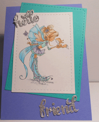
Hello Friend


I've missed doing my digital images with lots of sparkle and shine. Saw a challenge and decided this would be perfect for it.

Isn't she the cutest and really looks like she is saying 'hello friend' thats why I used that die cut.


I've coloured her with my favourite colour combination, added blue as well. There is lots ofWink of Stella but it really doesn't show. I think I need to go back to adding glue and glitter or glitter embossing cause it just doesn't show up in photos.
believe me it has lots of sparkle here.


Even my colouring looks a bit pale but she does look good in person, trust me!!!

Anyway to finish it off I cut the coloured image and the next layer with my stitched dies then attached directly to my light purple card stock. 
Cut my NBUS 'hello friend' words three times, twice in white and once silver glitter cardstock, boy does that have some bling.

These words are really cute but they do separate so I had to build a bit like a jigsaw but was very happy with the end result.

This card is for the new to me 'As You Like It Challenge' Favourite Layout and Why

Let me tell you why - I love using this layout because I struggle, really struggle to get my layers straight or even. This way I can place where I want as long as I remember to leave room for sentiments if needed. I LOVE this layout because I have the crookedest eye for layouts in the west.

Hope you enjoy your visit and come again.

Live Like its Spring Everyday


If this looks very familiar thats because its a remake of the card I did for this post.
I wasn't happy with it and knew that I would never give it to anyone. I didn't want to waste all the colouring either. so I pulled the card apart and saved what I could. New base and this time I stamped leaves on with distress ink Olive green and with a wet brush pulled the colour to lightly fill the leaves.
Had to be sparing as the grey cardstock was not watercolour paper and I didn't want it to warp.
I was able to save to top panel and added that and then stamped the Spring sentiment as we are just starting into Spring here in Australia.


Lost some flowers, so coloured some more to make sure I had a good colour range and this time I added much more sparingly and I like the end result. Flowers are from Altenew and need to be used more. They are so pretty.

No sparkle or gems as felt the flowers were enough. Of course its too late for the challenge but it is satisfying knowing I have fixed it.

Would be quite happy to give this to someone.

Thanks forcing to have a look and hope you visit again soon.

With Sympathy


I needed a With Sympathy card quickly as I rarely if ever make them. This one was very easy to do.

The image is a digital one (struggling to remember who it is from). If you want to know let me know and I will look up. At mum and dads so will have to wait on that. Coloured with copics and fussy cut around the frame. Then for bit of difference I used some cardboard that is corrugated.


Added the sentiment which I felt really fit with the flower and one gem. I am hoping this is CAS and fits the Challenge I wanted to enter it in.


Thanks for coming to visit and hope you come again. Would love it if you left a comment so I know you have been.

I found the link for this beautiful flower and when you go there don't just look at that. There are a really nice collection of digital images available. I have done cards before using other images. 


Saturday, 29 August 2015

Ric #90 Challenge

Ohhh my goodness I just had to try the runway challenge. Will fill in later as there is only 38 minutes to go.


I have attached the close up so you can see the way I cut the top of the yellow patterned paper better. On my distance shot I have cut off the corner and no time to fix just now/
I wanted to give a look of lacy as I don't have any die cuts that do that look so I used a couple of different dies and used the negative at the top as I really liked it.


I cut out leaves with my die cuts and the flowers are all Altenew hand cut as I don't have thuds for these.All coloured in with copics a couple of yellow up the top to show the extension of the lacy yellow. Probably should have started a bit lower on the flowers to show the edge better. I also stamped some random flowers and scrolls with grey on the grey cardstock but not happy with that end result. Too late to worry now.

Okay the lace at the top, the pale grey for the dress and the random flowers as on the dress. That was my interpretation of the runway picture.

Would like to enter this in the following challenge


Thank you for visiting.

Friday, 28 August 2015

YOU ARE THE song IN MY HEART

 Love that sentiment, finally used it. Too tired to do inside but think I will add 'Happy Anniversary' or 'I Love You'. Too much decision for now.

Alright I have done this card for the Less is More Challenge and of course there are only 10 hours left till closing. Really need to decide what I want to enter in and get organised enough to do so that people can see my card for longer than half a day before the challenge closes. If I could just take my crafting room with me when at mum and dads that would help but ahhh well no point in whinging is there.
I love how this card turned out. NOW do you want the easy five step version or the complex 25 step version. Lets go with what I should have done.
I had a piece of beautiful patterned paper with little gold and black music notes on it. That gave me the inspiration. I then thought of the music notes die. So I cut the piece of pattern paper to the width of the card base then used a stitch die that is just a straight length of stitch and cut edge so I cut the piece of paper at an angle to go with the layout on Less is More. I then cut the music notes die once in  gold card stock and twice in white. Glued them together and laid across the piece of patterned paper.


I gold embossed the sentiment using Miss Misti to line it up and make sure I got enough ink on the card to emboss. Forgot to rub the gold music die cut and patterned paper with the non static cushion so had a little bit of embossing powder stick there but its less noticeable in real life than on the photos.


Nothing stuck on the black card stock so thats something. I decided to finish it off with the red heart gem as I felt it needed just a little something.

Now if your wondering about the long version that I of course did. I die cut the music notes from the patterned paper then of course I had to make sure I kept all those weeny teeny little bits and pieces and glue them back in then line up for the die cut piece to go in properly and of course there were bits that were slightly out of alignment so more adjusting. I did start out thinking I would use the original die cut music piece from the patterned paper but as soon as I cut it I thought 'no, gold, would be better'. Well at least I know I can do again in short version.....


Better late than never. Hope you all enjoy your visit, forgive my spelling mistakes and come visit again.


Monday, 24 August 2015

Surprise


Its a total surprise that I have made this card. It was a last minute (Now thats not a surprise!!) decision but the way I chose to do it is so not me and I really enjoyed just going with the flow. It was a bit like doing TheDaily Marker Pop Up Challenge with lines. Just do what you think of.

So I picked one of my many many stencils that are like me many many stamps that haven't been used yet. I decided on this one with little scattered triangles and will have to explore it more. Usually I would use the whole stencil this time I just went down the right side in a messy way rather than laid out in a planned way. I blended with Distress Inks. Then


I added a bit of gold embossing paste. Of course it hasn't fully dried as I didn't decide to do this till there was only an hour left to the challenge (I must stop doing this as no one will have seen it before its time to vote - ahh well I will learn). 

I die cut Surprise in grey and then in black attached the black on top. Used a very small black gem for the dot on the i as that had disappeared.

Time to post this to Muse: Muse Challenge #129
had more to add but the internet is playing up something bad. have lost connection and finished this section four times already so will just sign off.

The hardest years


This sentiment arrived in the mail today and I just had to use it for the CASology numbers Challenge on this week. Could it get any better. then I had to thin about what to put with it to keep it clean and simple. Then I thought about the Hamster, he looks so......well ohhh my!!!!
Using Miss Misti I stamped the Hamster and the sentiment with black ink. Coloured in the hamster in brown tones, bit of grey for shadow under the hamster.


Heres a close up of my hamster, is he cute or what?? Was really happy with his colouring.

ok time to link this up with the challenge at

Hope you enjoy your visit and come visit again.


Wednesday, 19 August 2015

Sparkle Shaker Card

Stop the press. I finished it. Boy what a learning curve. Can still see things I have to do differently next time but I am totally happy with this.
I got the look I wanted and there are 40 minutes left so I am going to enter my third and final card. I'm pretty sure we can enter three times. If not doesn't matter, they  can just ignore it but you get to see it.


Well here it is, probably the most blinged card you will ever see.I love my bling but have learnt to be sparing with it as it can end up being a bit much. Also I love, love, love Annabells' beautiful gems and I have a bit of a supply but of course it it going down and I have never found it anywhere else.

Look at this shot it really looks like the gems are pouring into the bowl. See the wonderful smooth gems, they are the ones I got from Annabelle.

Anyhow the idea behind this card. Used the Jam jar die from Build a Boutique and the bowl is a small rainbow die upside down.
I cut first time on cardstock, then fun foam twice. Then I found with the foam doing two shapes can be dicy as it flattens and moved so it wasn't a perfect line up. Trimmed with scalpel but you can see at bottom of bowel bumpily white foam (should have glued some micro beads there to cover it but I will know for next time.
I marked out the outline of the bowl on my card base then blended a bit of orange distress ink there then brushed over with Copper Pearls to give a shimmery look.
Glued the layers together then realised I had forgotten the acetate, bowed my head for a little moment, thought about starting again and thought nahhhh. looked and saw I had a glue finger print on the front as well so better off making a new front, cut the two shapes, more trimming with scalpel. Added the first layer to the card base, poured in some micro beads, gems, sequins etc, glued some in place in both the jar and the bowl. Add the to top layer and once dry I stuck selection of gems and sequins.
Finished it off with the Sparkle Die Cut in gold.
I am more than happy. Now to try more shaker cards but more basic I think.


Better link it up before it closes. Thanks for coming to look and hope you come again.

I was just looking through the different challenges and realised I had forgotten to link this one to 
Now I am hoping that I have the right end of the stick here - anything with glitter meaning glitter and sparkle not glitter paper. My gems all glitter and a couple of the gems have glitter stuck all over them so heres hoping I got it right. If not please Fan-Tastic Tuesday, just ignore or remove.

Again thanks for coming to visit

Tuesday, 18 August 2015

Good Times

Bet you can guess why I'm here again today. I was so disappointed with my other card I have decided to do my first shaker card - thats a work in progress and I look at it as an improvement on my previous attempted card.

But of course I had to do another card so I would be happy. Now this I love and I have ended up stamping 8 cards in varied colours. The other seven still need their die cut or stamped sentiments and bling but its getting late and I thought I had best post my happy with card.

This has been done using a stamp from a brilliant stamp set by Annabelle, that sadly is no longer available. I used ink pads that I bought when I first started stamping. I can't believe they still work, they have never been reinked. This one is 'Fresh Greens' Kaleidacolor with 5 different colours that you click together to use.


I have 6 ink pads and sadly one is no longer what it was. It started life as brights yellow,red,blue,green & purple but now it is brown brown brown and darker brown. You will see later when I post the other cards. Doesn't look too bad for brown tones especially for me who only ever buys brights and lights. Why did this happen - because goose here forgot to pull the colours apart when last used, maybe a year ago so the inks have soaked and mingled quite well.

Buts let concentrate on this one. Other than the two little circle further down the stamp I used is the full amount I stamped here so I just pulled the ink along the circles only using two and a very little bit of the next colour down. 
Doesn't it look brilliant, I used the Misti so one I had it lined up where I wanted to stamp I was able to just slide the next piece of card stock into place. Wipe the stamp down with a cloth and add the next colour. I found lifting the door where the stamp is placed I could see if the ink had coated well or not as the stamp is a clear one.

When finished I then trimmed down and attached the 'Good Times' die cut along the top edge of the stamped image.


Went through my gems and used all gems  from Annabelle that are also no longer available and I have lots of in all colours. They need to be glued in place but well worth it. They are beautiful to look at. They vary in size and colours. Truly beautiful. Not sure if you can see that in the close up but I did a close up just to show that.

Ok time to link this into the challenge before it closes

second card.

Hope you enjoyed your visit and come again.

Virginia's View Challenge - Embellishments

I had an idea. I tinkered last night and finished this morning. I wanted to do a jar with gems and embellishments falling out. I decided to mask the inside of the jar from a rubber stamp that goes with Build a Bouquet. I masked the inside of the jar to cover the stems and 'hello'. Embossed with white embossing. Then I stamped the gems in clear and embossed some in gold and some in silver.

Talk about make major work for myself, trying to mask everything alternating gold and silver. Had a couple of blow outs where the powder got under the mask and the heat set it. even ended up embossing some repetitional sticky stuff (luckily that came off). I then watercolored the gems with Peerless watercolours. The orange gem coming out of the jar was not good as the white from the jar was within the gem.

Then I found the jar was tooooooo pale and didn't show up with just a faint green inside the jar. went slightly darker, still not working so added grey to the outside then darker grey. Was like the never ending story.
Time to add the embellishments - I used some that had adhesive backs but post had to be glued. I have used gems, holographic sprinkles, itty bitty mic beads, went a bit berserk. Finally decided to stop and take a photo.

If I had to do it again I would 
  • Make a shaker card, should have made a shaker card just this idea popped in first  and never thought of shaker till this morning.
  • think about those gems in the jar, if you want one coming out and hanging on the lip of the jar you need more masking and the gem should have been very faint behind the green that I had carried along the rim.
  • stop when the gems are looking soft and watercolored not keep going till they are very dark and bland.
I nearly didn't post this as I looked at it on the computer and my first thought was 'what the heck were you thinking Aileen????'

But I think its good to see the disasters as well as the successes. Just cause all my other cards are perfect hehehe. No you know what I mean. For me there is so much wrong with this but it was buzzing round in my head for a couple of days and now its done. Embossed gold and silver speckles, over painted, over everything and all.


Hope you will come visit again.

Sunday, 16 August 2015

Hello card - lines and colours

What an interesting experience this was. I decided to have a go in Kathy's Daily Marker Pop Up Challenge. I just used a thick piece of printer paper as I didn't know if it would work and didn't want to waste copic cardstock.
I really wasn't comfortable with this idea. I like to use stamps where someone else has done the design and I get to colour and use. But there is a first time for everything and I have to say I have totally enjoyed the end result.


There were a couple of false starts where I drew lines then didn't like what I saw, threw it aside and went to do something else but had to push myself and basically say 'come on Aileen, do it'.
So I drew all the lines with a very thin Copic Multiliner 0.05. There were some sections where the lines were nearly invisible but I left as was. Then I just randomly picked out colours, light and bright cause thats me.
I tried to pre decide where colours should go and should be consistent then found I just wanted to colour and enjoy it so I did. Went in and recoloured a couple of time so probably wastes a bit of ink but wasn't too fussed.
Once I was happy with the colour fill, I went in with the  Sharpie Fine Point Black. couple of wobbles there that I think I caught okay. Probably could have done more with some wide bands of colour but was happy with what I was seeing.
Then I added the little itty bitty lines (eyelashes) on one side only of each line.

With the close up you can see some of those wobbles.

I really liked stand decided to make a card after all.

Cut out the Simon Says 'Hello', saved the little bits. Glued the coloured piece to a white card base and added in the little bits so Hello was clear on the card.


Wonky photo here but you can see side on.

Was going to multi layer the hello and put back into place but I decided I liked the card with the negative only. Will use this Hello on another card. Doesn't that look brilliant, looks like I have used pre patterned paper.


Hope I got the right link there. Thanks for coming to look and see you again soon.


Saturday, 15 August 2015

Butterfly with Washi tape

I decided to have a go at the Butterfly Challenge using Washi Tape,   next time I think I will try die cutting the tape because I don't like my end result but as I went to remove the tape of course it pulled some of the card off so had to put back. Ahh well my lesson is I have a pile of Washi tape that is going to be really good for keeping dies in place or for masking but I don't like whelk on my cards.

I did try this before but decided to try again, it just doesn't work for me. Here we go:


I stamped the butterfly four times, three on the card stock in a line the fourth on a scrap of cardstock.
This beautiful butterfly is a Technique Tuesday one. I then coloured the butterflies with copics. No glitter today.


Its a bit clearer on this one that I added the fourth one that I cut out totally to the middle butterfly and once glued tight I put a little dimensional tape behind to make this butterfly stand away so you could see the one under.

I'm not sure if you can see but I actually cut around all the butterflies from the bottom  of the last wing and up and around each butterfly to leave the wing hanging over then folded the card so the back is flush with the end tips of the wings.

After trimming round the butterflies I then added the sentiment. Then looked at all my washi tape of course I had nothing NOTHING to match the colour I coloured the butterflies. I am so bad at planning.
Anyway decided to go with oranges and laying and overlapping. I ended up with two marks on the card front, a mystery blue up the top and a black smudge near the middle butterfly. What can you do with it?????
I covered with white gel pen. It will do. No way I was starting all that fussy cutting again.

Lucky I love these  butterflies and how they turned out.

Entering this in:


Also entering in:

okay that sit, I hope you enjoy your visit and come again soon.

Thursday, 13 August 2015

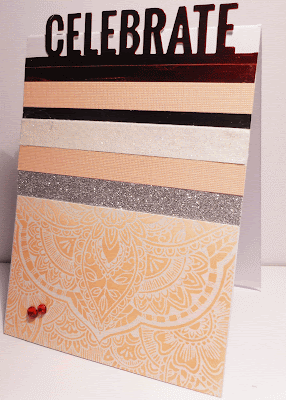
Celebrate

Well I just couldn't sit and not try again for the Ric Challenge. I went back and read the rules and suggestions then looked at the shared graphic again and as I picked Elysha up from her day out it came to me.
In the door, sorry just let me do this.......2 hours later and its finished.


I cannot believe that I could not catch the splendour of this card. You will have to image ok:
The bottom panel, yes its that Hero Art background stamp again, I need to get some more delicate backgrounds. Anyway this one I heat embossed with Hero Art Sparkle embossing powder. If you go to the bottom picture and click and enlarge you can see the sparkly white speckles everywhere.

I lightly blended one of the orange/apricot inks and it really does look soft. I cut the panel in half.


You can see how light the blending is here. This is the soft tull of the dress.I then added bands of different paper products to represent the bodice of the dress. Silver glitter paper, Peach coloured cardstock, white sparkly paper that is more like a material than a paper, a thin band of shiny black paper, the peach colour again then the red shiny card stock that I cut the Celebrate out of.

Finished off with a couple of red gems to represent the red shoes. Vola 


Heres the close up; you can see the pickle specks of clear glitter.

I hope your allowed to enter a couple of times. Couldn't find a specification there so here goes
Entry number two

hope you enjoyed your visit and please come again.


Happiness is a Butterfly


Decided it was time I took up a challenge in the One-Layer Simplicity Challenge. Kept it very simple and didn't go with my first thought 'Strip Down' I have this very lovely digital stamp where......
No I won't go there, lets stick to the points here.

I have done a very easy one layer card, placed removable tape each side then blended with Distress Inks Peacock Feathers and Mermaid Lagoon. Talk about a beautiful combination. Once finished blending then I got two butterfly stamps and randomly stamped them in their matching colours. I did one butterfly half and half with the inks - can you see it.


Then I used Miss Misti to position my sentiment and stamped in pale grey Hero Arts Ink. Stamped it twice to make sure it was clear. Felt it turned out ok, must admit as I pressed the sentiment down I had misgivings as the Versamark Black ink is so crisp and clear but felt it turned out ok.


here it is slightly side on, you can see how those colours just work perfectly together. No gems, beads or layers as it is simplicity itself.

Entering in the Challenge

I hope you have enjoyed your visit and come again soon.

Wednesday, 12 August 2015

a bouquet of flowers 'Hello'

First you don't hear from me for days then I hit you twice on the one night. I was just checking the blogs and saw that the Simon Says - tied up was about to end. I had painted these flowers earlier today so time to use them.

Better move it cause there was only an hour to go about 30 minutes ago.

 All flowers and jar are die cut, white embossed on watercolour paper and painted with very light coats of Peerless and added to as each layer dried.

Placed on a patterned piece of paper (yes it looks like wallpaper again). becoming an obsession, we don't have any here so most be subconscious.

Anyway heres the card


I lacked time today but I intend to add a bit of blurry green to infer the wallpaper behind. will take a photo and add if you feel like coming back tomorrow.

did a pile of the roses, daisies, leaves and hydrangeas  so it was just a matter of mix and match till I felt they were right.
Filled in the white embossed 'Hello' that is on the jar with a silver Uniball pen.

Tied multi coloured twine around the top of the jar as The jar is a gift for someone.


Posted with 30 minutes to spare - whoop forgot one photo- close up


Okay best to post it now:


thanks for coming to visit and I hope you come again.

Going to the Ball

I couldn't think of a better title as I haven't used a sentiment on this card. My inspiration for this card is this picture:


When I saw this photo I loved the dress, all that tulle, the soft colour, the little bits of silver, white, black, red and the sot green background.
I looked at everyone else's inspiration and all I could think of was using someone else's idea. That wasn't what the picture was saying to me. If you go through my blog you can see I love to colour in, copics, watercolour, intense pencils. So I decided to have a go even if its not what is expected. I get that they aren't looking for models and imitations but one of the Saturated Canary images just kept popping up in my head and decided tonight to go with that flow.

Here she is:

the sheer apricot gown flowing from the silver mesh bustier. Satin white gloves and satin apricot ribbon in her hair.


Finished off with red roses and delicate daisies and wee little silver tipped pins in her hair.


to Finish the card off I have run a gold strip down each side of the cardbase then attached the top layer. I wanted to add some greenery. I did this by die cutting a Hero Art palm leaf die I have then using the negative. I sponged or lightly dabbed actually with one of the Hero Art pale green inks, love the finished look.

As you can see her hair has been styled to perfection with soft brown streaks added and a couple of tendrils left out each side to soft the do. Ohh I crack myself up sometimes.

As is obvious I am entering this in the Challenge


If I have taken the interpretation the wrong way please delete my entry.

Thanks for visiting and I hope you come again.


Monday, 10 August 2015

To love and be loved is precious


I started this card with all good intentions but my day did not go the way I planned so another one that had to be photographed at night.
I find night photos a. you are lucky to see the sparkle when its added and b. photos are less forgiving. I can see when the paint ended up on the card and was cleaned off. I can't when looking at the card but in each photo I can. Ahh well them the breaks.

I love how this card turned out. At first I was going to do the gems all one colour then thought nah rainbow colours. Then I was thinking of having the gems on the opposite side in the same order so it looked like a necklace but after stamping and silver embossing one side I felt it looked perfect just running down one side and would have looked too busy down both.

I decided to silver emboss this one and will do another with white embossing so I can see if it looks as good or better. Honest;y the painting is just light enough with a bit here and there darker for depth, everything is silver embossed and looks brilliant IRL. One gem I did not clean the area well enough so we have speckles of silver.

I might even do a card where its just silver embossed and no colour added because I liked that look too.

Back to the card

Once the Peerless watercolour had dried I covered each gem with the Wink of Stella Clear glitter and it truly does sparkle.

This is my interpretation of 'Precious' 
The sentiment is a combination of two sentiments. The precious along with the gems I used is all a Winnie and Walter set. 'To love and be loved' is part of a PTI sentiment that I cut apart but can be put back together.

I would like to enter this in:

sorry to anyone who gets this as a double post but I just saw 
its perfect for there.


Thank you so much for coming to visit and hopeI see you again.